Why your business needs a clean website
Did you know that about 71.2% of small businesses in America have websites? How are they even thriving?
In recent years most of the population has access to the internet. Whether it’s from a computer or a phone, people are connected to the internet on a daily basis. Everyone who has a phone usually uses it to find what they need (or want). If your business is not on the internet you’re losing a lot of potential customers. For those who do have websites, are your websites clean and/or modern?
Customers expect a lot from your website from the UI to the customer service. A poll from SWEOR, a webflow solutions company, says that “57% of internet users” will not recommend a business if the website does not seem legitimate. Moreover, some people will even think that dated websites are scams. You should think of your website as if it were one of your business’s locations. You wouldn’t want your office or store front to look rundown would you? This is why it is important to keep your website maintained just like a physical location.
There are several ways you can keep your website looking clean. One would be to consult with a graphic designer or maybe a few customers, and ask what they think about your website. Maybe change the layout or make it more user friendly. You should also keep any information up to date because most of the time customers will look to your website for any questions they might have. You should also think about your logo because it is one of your trademarks which everyone will know your company by.
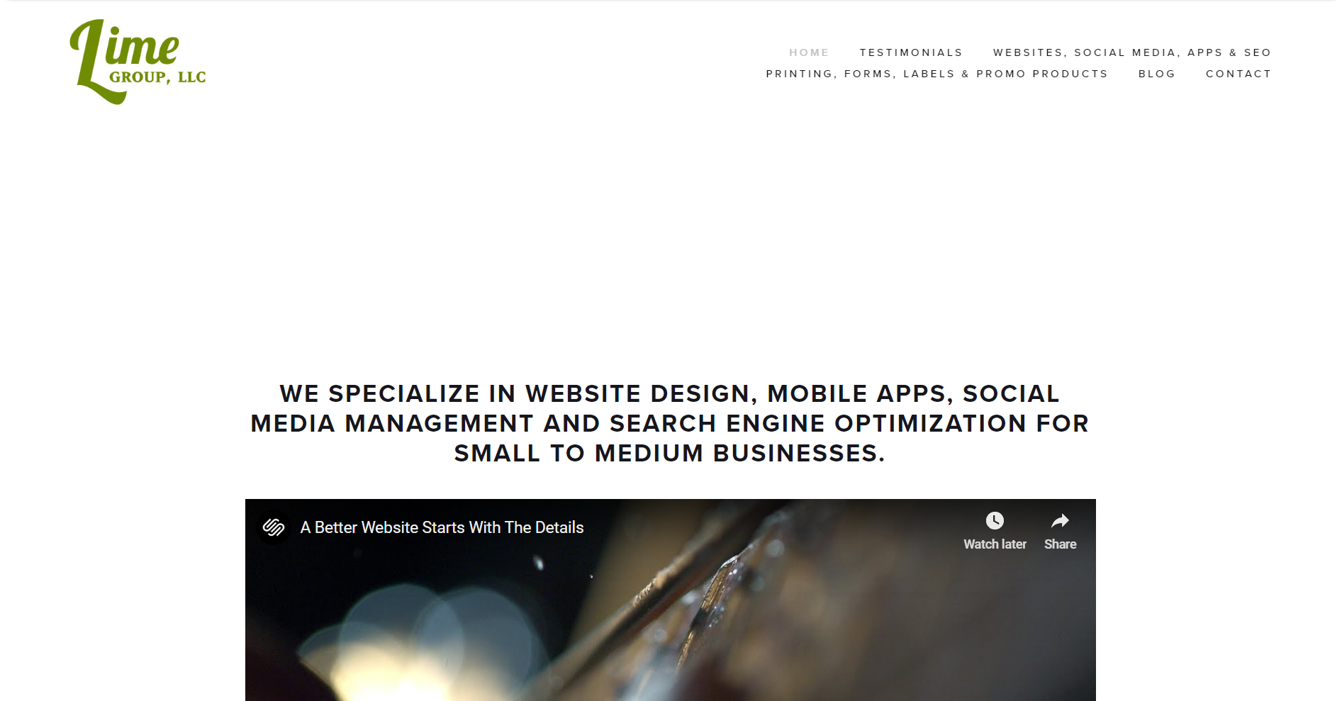
Here is an example of the Lime Group website during the commencement of the company.
This layout is very dull and has a lot of whitespace. The website did not have a lot of eye-catching visuals which made it sort of stale in a sense. The logo looked fine, but I believe it gave the wrong impression. I can go into more detail about how a logo should look, but that is a topic for another day.
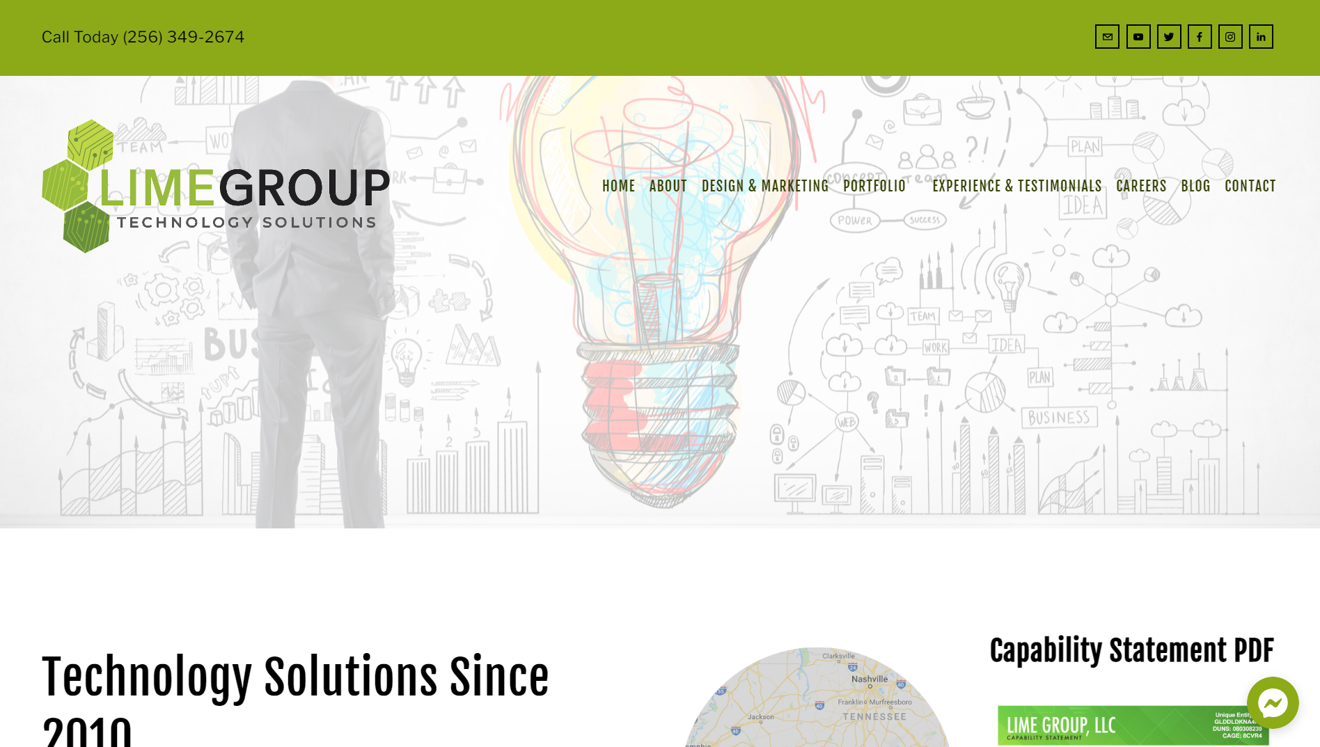
Here is the current layout of the website.
This website layout is more visually pleasing and has more eye-catching elements. As you can see the logo is more modern and gives the impression that we are a tech company. Not only that, but it utilizes more of the color palette.
Now I hope you understand the importance of keeping your website modern. Stay tuned for more tips on bettering your business’s website. If you have felt inspired by this post or need help with growing your business’s digital presence contact our team today!
Sources:


